")
PAINTED IN PRADA: PRADA WOMENSWEAR PRE-FALL 2020 ADV CAMPAIGN
The power of the hand and the impact of image; the intimacy of clothing; the power and positivity of color. And the blurring of reality with digital, something now being experienced everyday – a new idea of intimacy, a surreality reflective of these very particular times. The Pre-Fall 2020 Prada campaign is engineered to react to a changed world, reflecting a fusion of the human hand and eye with technology – each equally important, a hybrid means of communication, expression and creativity.
PAINTED IN PRADA: PRADA WOMENSWEAR PRE-FALL 2020 ADV CAMPAIGN
Conceived and created together with the Prada Fall / Winter 2020 collection of men’s clothing presented in January, in the Fall 2020 pre-collection, the color recalibrates the classic garments to give them a new topicality, a surreal atmosphere.
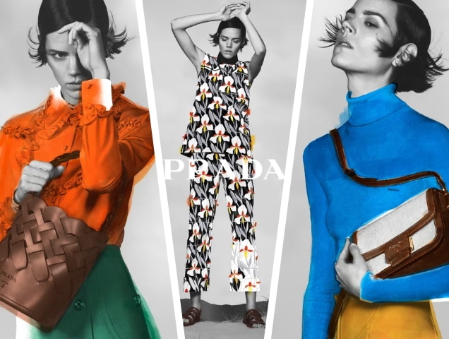
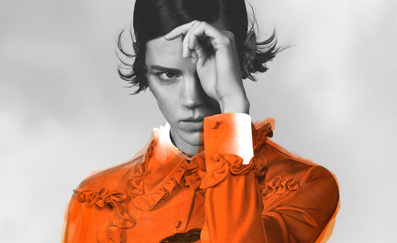
The campaign images and video combine hand-painted watercolors with digital art. The silhouettes of the garments are converted into “paint by numbers” layers, to make energetic explorations of color with a dozen of Prada’s characteristic shades such as light blue, pink, yellow, orange, green, etc.

Conceived and created alongside the Prada Fall/Winter 2020 menswear collection presented in January, for Pre-Fall 2020 color recalibrates classic garments, to give outfits a new actuality, a surreal ambiance. For the accompanying campaign, photographed in London on 13 February 2020 by David Sims and painted in New York during the following weeks, physicality is questioned: the collection’s vibrant colors are isolated, abstracted, pushed center stage, highlighting their material essence and their disarming simplicity. Colorful clothes become pure color, color challenges the classic form of the photographs.
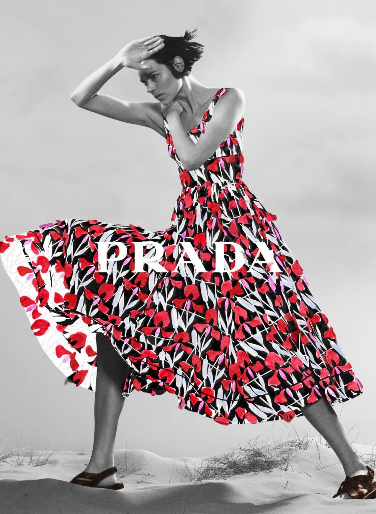
The images and campaign films combine hand-painted watercolors with digital artistry. David Sims’ black and white images of Freja Beha Erichsen act as monochrome canvasses for a subsequent
intervention, creative expression via saturated color, applied with improvised spontaneity over the image. The silhouettes of the clothes, their seams and patterns, become ‘paint by numbers’ frames for energetic explorations of color – a dozen Prada-ist shades of Celeste blue, pink, yellow, orange, green and more.

The campaign films propose another twist, transforming the model into the maker: Beha Erichsen determines her own image, her own authorship, brushing color onto her clothes and accessories in a surrealist gesture, simultaneously bringing them and her to life. These films will also give life to a multi-layered narrative through digital portals and the Prada Instagram.

At a moment where our experience of society and culture is defined by the picture plane – computers, phones, television and magazine pages – with people at a remove from one another, this campaign takes inspiration from the accidental, the imperfection of handcraft and the unfinished nature of human interaction. Blurring lines between the photographic and the painterly, between technology and humanity, it is a subconscious echo of our moment. The joy of color via the joy of technology – both a means of communicating a message, immediately. Ultimately, that message is positivity – a fantasy, painted in Prada colors.
Credits: PRADA
Creative Direction by Ferdinando Verderi
Photography by David Sims
Styling by Olivier Rizzo
Films by Ferdinando Verderi


 (1)")

Leave a Reply
Want to join the discussion?Feel free to contribute!